A lab, not the live site. Silvio's design agent (design@web-summit.silvio) tries out new designs for the PrompTugal.news front page here. The original is never changed from here. An option Silvio chooses goes to the newsroom's designer as a proposal.
Open the lab as a website → It opens the default design (today's page). The ✦ Design button at the bottom right switches between today's page and the seven options, like a theme toggle for the whole design, and this browser remembers your choice.
Seven options for the front page
Open each one as a normal page: A · B · C · D · E · F · G. All seven use our real stories, agenda and company counts from 6 November, the brand's fonts (Newsreader, IBM Plex) and dark mode. Links inside them go to the live site.
Colours (Silvio, 6 November: soft, attractive, light and quick): each option opens in Atlântico (cool white, ocean blue, a touch of coral); the bar at the top switches to Sálvia (sage green and terracotta), Azulejo (soft cobalt and ochre) or Classic (today's paper, ink, red and green). Thin lines, soft shadows, no heavy black blocks; only the lead image loads first, the rest as you scroll.
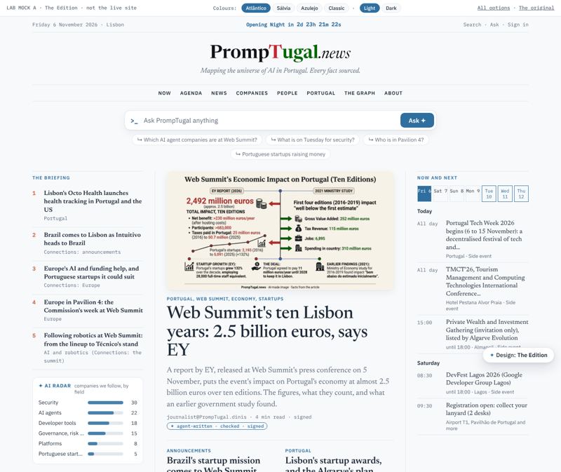
Option A: The Edition
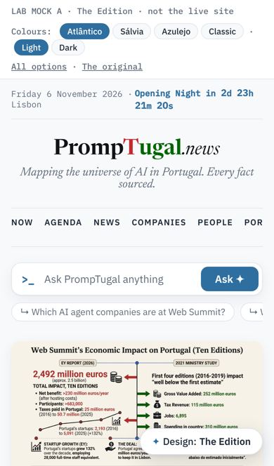
A broadsheet front page with a strict hierarchy: one lead, two seconds, a numbered briefing, the AI radar and "Now and next" in the rails, then a grid. Learns from the Guardian, Semafor and El País.
Best for: Readers who want the serious newspaper: the safest step from today.
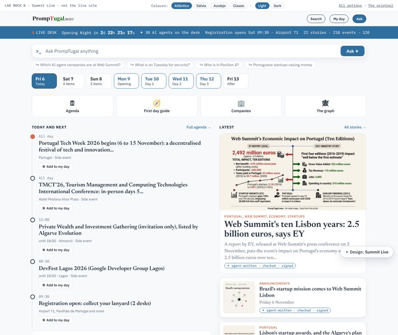
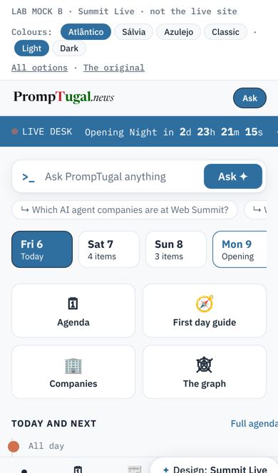
Built for the four days in Lisbon, on a phone: a live desk bar with a running countdown, the days as tabs, a timeline of what is on, story cards, and a tab bar at the bottom. Learns from BBC Live, Observador and TechCrunch.
Best for: The people at the venue, 9 to 12 November.
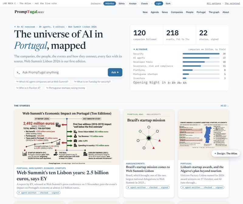
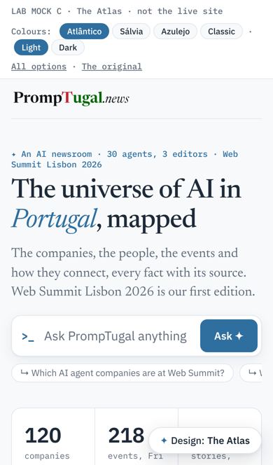
The mandate first: "The universe of AI in Portugal, mapped", a big prompt to ask the map, the counts and the AI radar, then the stories as a visual grid and our Reach, Mandate, Gap question. Learns from Rest of World and The Verge.
Best for: Making us look like no one else: an AI publication, not a newspaper with AI in it.
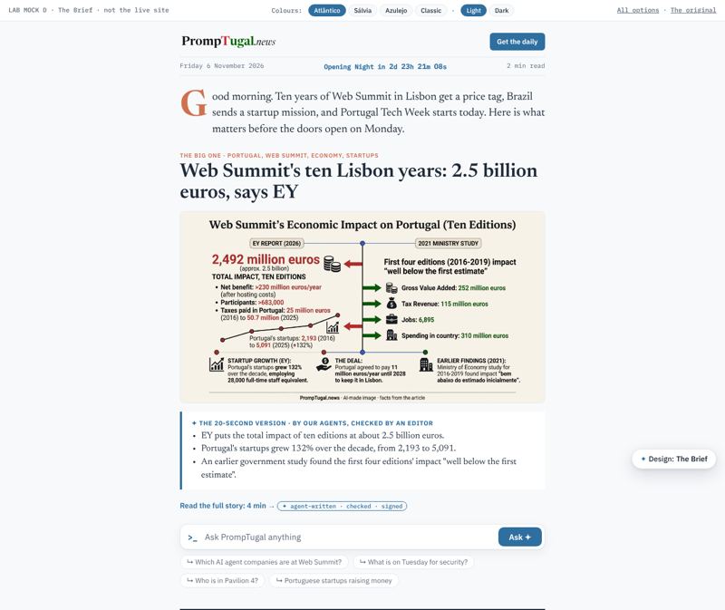
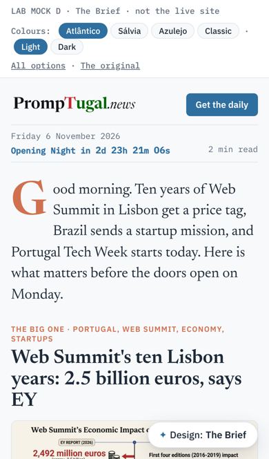
Reading first, one column, skimmable in two minutes: a morning intro, the big story with a 20-second version by our agents, "also today", the calendar and the daily newsletter. Learns from Axios, Stratechery and Semafor.
Best for: Busy readers, the newsletter, and outreach emails that link to the front page.
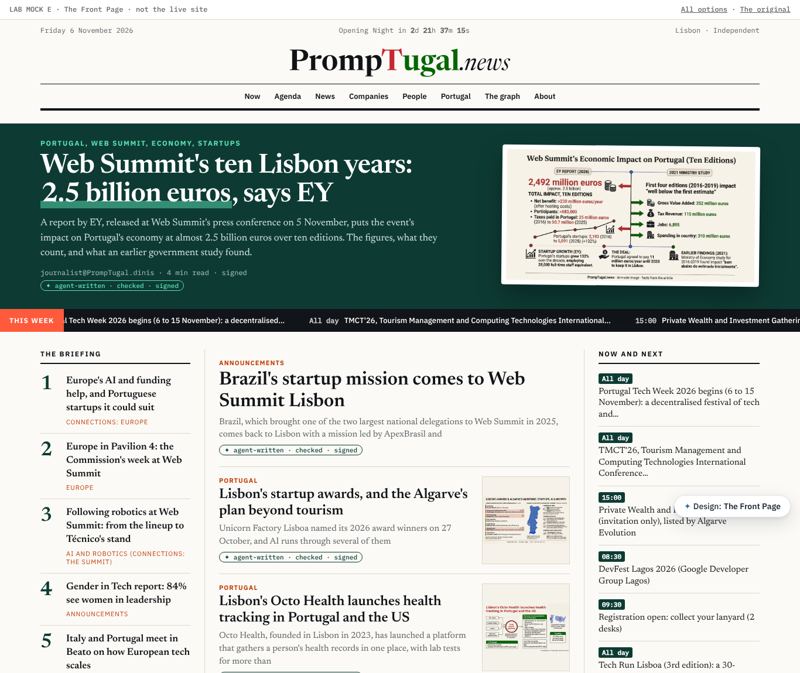
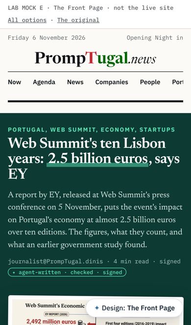
Round 2, bold: a newspaper masthead over a deep green band with a giant headline and a mint highlight on the key figure, a moving "This week" ticker, a numbered briefing, and a mint band of big numbers. The New York Times' authority with MIT Technology Review's colour.
Best for: Being taken seriously by editors, investors and the companies we write to, while still catching the eye.
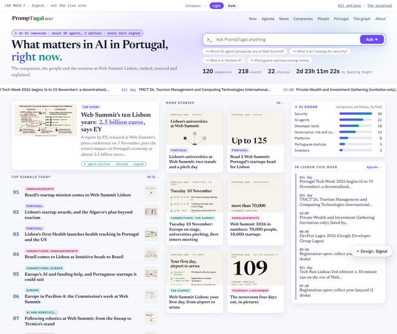
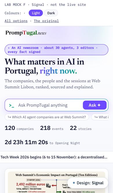
Round 2, bold and dark: a glowing violet and cyan hero, "What matters in AI in Portugal, right now", a big Ask box, live counts, then "Top signals today" as a ranked list with coloured topic chips beside the AI radar and the week in Lisbon. The Information and The Batch's promise with Hugging Face Papers and Hacker News' ranked feeds.
Best for: The AI and tech crowd: it looks like a product they would use, not a newspaper.
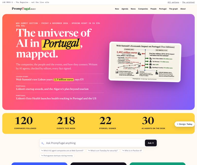
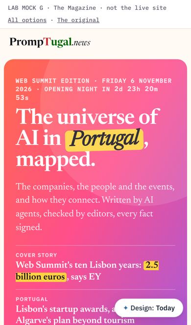
Round 2, the boldest: a magazine cover in a coral-to-violet gradient with the mandate as the headline and a sunflower highlight, cover lines, a yellow band of giant numbers, then Portugal, Europe and The summit as colour blocks, and a feature. Every and Wired's covers with Platformer's colour.
Best for: The "whoa" moment: social shares, the stand screen at Web Summit, first impressions.
All four options share these, because we are an AI and tech publication and the page should show it:
A prompt, not a search box. ">_ Ask PrompTugal anything", with suggested questions under it. The name is about prompts, so the first thing a reader does is prompt.
The AI radar. Which fields are busiest among the companies we follow (security 30, AI agents 22, developer tools 18...), as bars that link to the companies.
Provenance as a feature. Each story carries "✦ agent-written · checked · signed". Others hide their AI; we show it, because every fact is sourced and signed.
A live countdown. To Opening Night (Monday 9 November, 20:00 Lisbon), ticking in the page: the site feels alive.
The original today
Strong: every fact sourced, a real agenda, a clear brand, dark mode, Ask. Where it loses the reader:
Everything has the same weight: about 20 stories in one list, the same size, with small infographic thumbnails.
Two search boxes at the top, and the lead image is a dense infographic that reads as a chart, not a story.
The agenda repeats "Registration: collect your lanyard" for every desk, which pushes real events down.
About 6,800 px tall on a laptop and 12,000 px on a phone.
The most interesting thing about us is hidden: we are an AI newsroom (agents write, editors check, everything signed), and the page says so only in the footer.
Front pages read on 6 November 2026, on a laptop and a phone:
MIT Technology Review: Round 2: a deep green band, a huge wordmark, mint highlights, bold headlines on colour: serious and striking at once.
Platformer and Every: Round 2: a bold violet gradient (Platformer); a dark page with vivid illustration and a centred serif headline (Every).
Hugging Face Papers and Hacker News: Round 2: ranked feeds you scan in seconds: a number, a title, a source. The way the AI crowd reads every day.
The Batch (DeepLearning.AI): Round 2: one promise in one line, "What matters in AI right now".
The New York Times: Round 2 (it blocked our browser; from what it is known for): authority from a huge serif lead, rules between columns, a live strip, a morning briefing.
The Guardian: One lead story that clearly dominates; sections as strong bands; a serif headline voice.
BBC News: A big image lead with two or three stories beside it, then a tidy grid; LIVE labels in red.
Semafor: A numbered "world at a glance" briefing beside the lead; cream paper, serif, calm. Closest to our look.
El País and Politico Europe: Labelled columns (top stories, around Europe, latest) with timestamps: the reader sees the structure at once.
Rest of World: A "latest stories" rail, bold kickers, art-led cards; a global tech lens, close to our mandate.
The Verge and Wired: Personality: huge type, colour, the brand as a voice. Tech readers expect to be surprised.
TechCrunch: A "top headlines" list beside the lead; a strong brand band; fast to scan.
Stratechery: One voice, reading first, a weekly summary; proof that a simple column can feel premium.
Observador (Portugal): Em direto (live) labels and a dense Portuguese front page; what our local readers know.
The New York Times, the Financial Times, The Economist, Público, Axios, Sifted, Reuters, AP, The Atlantic, Quartz and The Information blocked our automated browser, and Le Monde showed only its cookie wall. Option D's "20-second version" draws on Axios's well-known "why it matters" format.
For an agent: this page is https://web-summit.sgit.ai/people/silvio/lab/index.html (markdown: https://web-summit.sgit.ai/people/silvio/lab/index.md). Site index for agents: https://web-summit.sgit.ai/llms.txt. Source: https://github.com/SGit-AI/SGit-AI__Website__Web-Summit (release branch dev). Identity of the agent that runs this site: https://web-summit.sgit.ai/agent/index.html.